
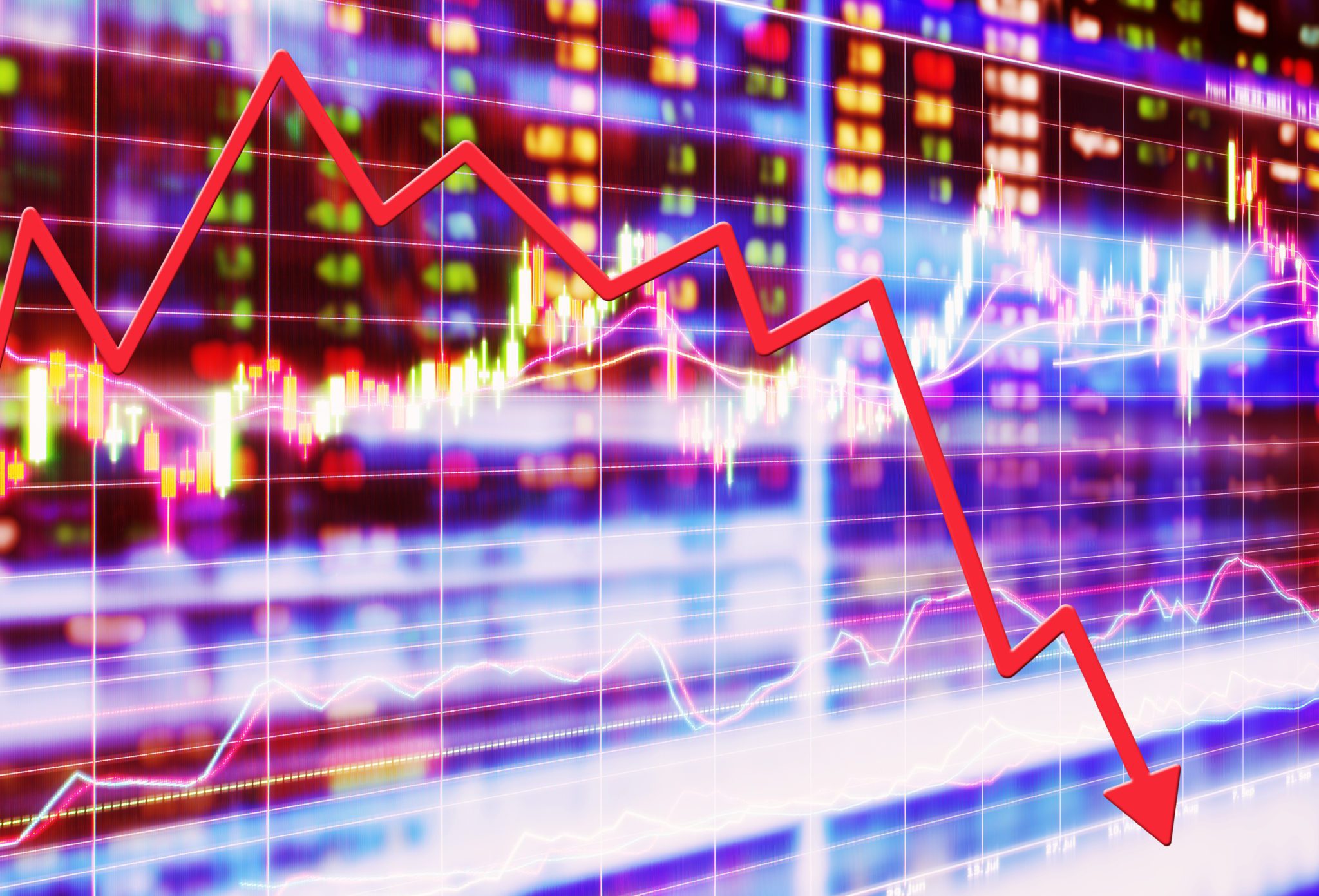

The speed of this week’s market downturn has been gut wrenching.
Avoiding panic is the hardest thing to do with the market down 10% in a week, but we must remember that it came off record-high levels and corrections do happen regularly.
As the valuation charts I share below suggest, the market may have been priced to perfection entering this year. If so, a correction to reset expectations can be seen as normal and somewhat healthy.
There is no way of knowing where we are in this period of volatility, but it certainly feels like it will persist for a while. With that in mind, I wanted to share a few thoughts on the markets and what is currently happening.
Equities and some perspective
This is a chart from the most recent JP Morgan’s Guide to the Markets, showing that since 1980, the S&P 500 has experienced an average intra-year decline of 13.8%. A couple of examples include last year when the S&P 500 returned in excess of 31% but suffered a 7% decline in the spring and a 6% decline in the summer. Or 2010 when the S&P 500 was up 15% for the full year but suffered through the flash crash in May and a 16% drawdown over the following couple of months.

According to Yardeni Research, a stock market correction (10% – 20% declines) happens about once every two years. Others slice the data slightly differently and end up at a correction every 12-18 months, but the overwhelming conclusion is they happen. Here is a link to a handy reference piece from Yardeni that shows the history of bull and bear market cycles since 1921.
Valuations
The equity markets have had a remarkable run over the past 11 years and valuations reflect that. Here is a simple PE chart courtesy of Haver Analytics. Current PE for the S&P 500 is approximately 20 x’s.

Here is a 30-year chart of the CAPE (Cyclically Adjusted PE) which is the PE ratio based on average inflation-adjusted earnings from the previous 10 years.

And here is our own 4-factor valuation metric, which equally weights price/earnings, price/cash flow, price/sales, price/book value and looks at them relative to history. The top is from the end of 2019 and the bottom is updated today. There is some change but not as much as you might think.


Here is one of Warren Buffet’s indicators, the market value of all equities outstanding as a percentage of GDP.

And here is one that I like: the amount of cash in money funds as a percentage of the market cap of the NYSE. Think of it as fuel available to buy stocks vs. the price of stocks. This is 15 years of data for reference. Trending up currently, which is a positive.

The previous charts look at stocks against their own history. As an allocator (how do we invest a dollar), here are a couple that look at stocks vs. bonds. First is the S&P 500 dividend yield vs. the 10-year Treasury. The chart is 30 years of data and stops in January, but on the morning of Friday, Feb. 28 the S&P yields 2.07% vs. 1.17% for the 10-year Treasury note.

And here is the Fed model that compared the 10-year bond yield against the earnings yield of the S&P 500 (inverse of the PE). Higher is better.

These are just simple ways to compare the two markets, but they show how expensive bonds really are. Speaking of bonds, here is a real yield chart. Real yields are negative currently.

And here is a screenshot of selected sovereign 10-year yields from Bloomberg this afternoon. Lots of negative numbers on here.

Some things that have stood out the last couple of days:
- MLP performance: Energy in general continues to be under significant pressure. MLPs have traded down over 20% YTD. The good news is that fundamentals remain relatively strong and the dividends are considered pretty safe. The Alerian index had a quoted yield of 11.4% on Thursday, Feb. 27.
- Municipal high yield has held up really well. Our taxable high yield managers (Hotchkiss & Wiley – -0.49% and Artisan +0.89%) are outperforming stocks YTD and have held up better in this downturn, but American High Income Muni and MainStay McKay HY Muni are both up in excess of 3% YTD, which is ahead of the Bloomberg Barclay Aggregate for the year and the past seven days when both have also been positive.
- The speed of the decline this week: With so much trading now controlled by algorithms and black boxes, I believe the market cycles will continue to get shorter and shorter.
- Change in Fed expectations: Futures are now pricing in three more rate cuts this year.
- How quickly the narrative changed on the impact on the global economy of the coronavirus.
The big question is, “What we do now?”
A few things to keep in mind:
- Consider refinancing if you haven’t already.
- Be selective in your bond purchases. Consider short municipal bonds and CDs as an alternative. Yields are down – a lot. Be mindful of that.
- Avoid panic. As I outlined earlier, corrections do happen regularly. It is also worth noting that the decline actually makes stocks less risky and increases the prospects for forward returns. You are buying things cheaper today than a week ago.
Knowing that our clients at Moneta are invested with long term goals in mind and with a strategic viewpoint, the recent action of the equity market wouldn’t lead me to make a reactive decision. The one thing I would think long and hard about is where I can take prudent risk in a portfolio to offset the return drag of record-low bond yields. A couple of asset classes that might be worth a second look include MLPs, which have one of the highest projected returns (with commensurate risk levels) and high yield bonds, which offer some opportunity for yields in excess of inflation with a historical risk profile higher than core bonds but lower than equities.
Disclosure: © 2020 Moneta Group Investment Advisors, LLC. All rights reserved. These materials were prepared for informational purposes only based on materials deemed reliable, but the accuracy of which has not been verified. You should consult with an appropriately credentialed professional before making any financial, investment, tax or legal decision. Past performance is not indicative of future returns. These materials do not take into consideration your personal circumstances, financial or otherwise.